A guide to choosing your kitchen colour

Colour is a highly personal choice

How to choose the right colour for your kitchen

Colour schemes, as a rule, follow scientific theory based largely on Newton’s colour wheel. Here, schemes are based on the relationship between colours, placed at certain intervals around the wheel, to create a group of colours that work harmoniously with each other. The wheel is made up of primary, secondary and tertiary colours which can be altered through tint, shade and tone to create lighter or darker versions by adding white, black or grey. This makes for an infinite range of colour possibilities and a huge range of choice, which, when following some basic principles of colour theory, doesn’t have to be daunting.

NEUTRALS

Technically speaking, neutral colours are simply those not present on the colour wheel. Namely, white and black, and the combination of these, grey. We often refer to neutrals as being colours that work well alongside all others and these are often perceived as being light in tone. However, dark shades with a high percentage of black can be just as neutral as light tones and will work equally well in colour schemes. Neutrals will always suit a kitchen due to their timeless nature and inability to go out of fashion. We favour them, not simply for this, but for their versatility, the way in which accents of colour can be added, through light fittings, door furniture, tiling and accessories. The advantage of this is the ability to change these items, relatively inexpensively, as your tastes and trends evolve, to always keep your kitchen looking fresh and up to date.

COLOUR SCHEMES

Three schemes we fall upon, time and again, offer fail safe combinations of colour and don’t have to be limited to just your kitchen. In other rooms leading off the kitchen, or in an open setting, these schemes can be applied to create a harmonious colour palette that flows throughout the home.

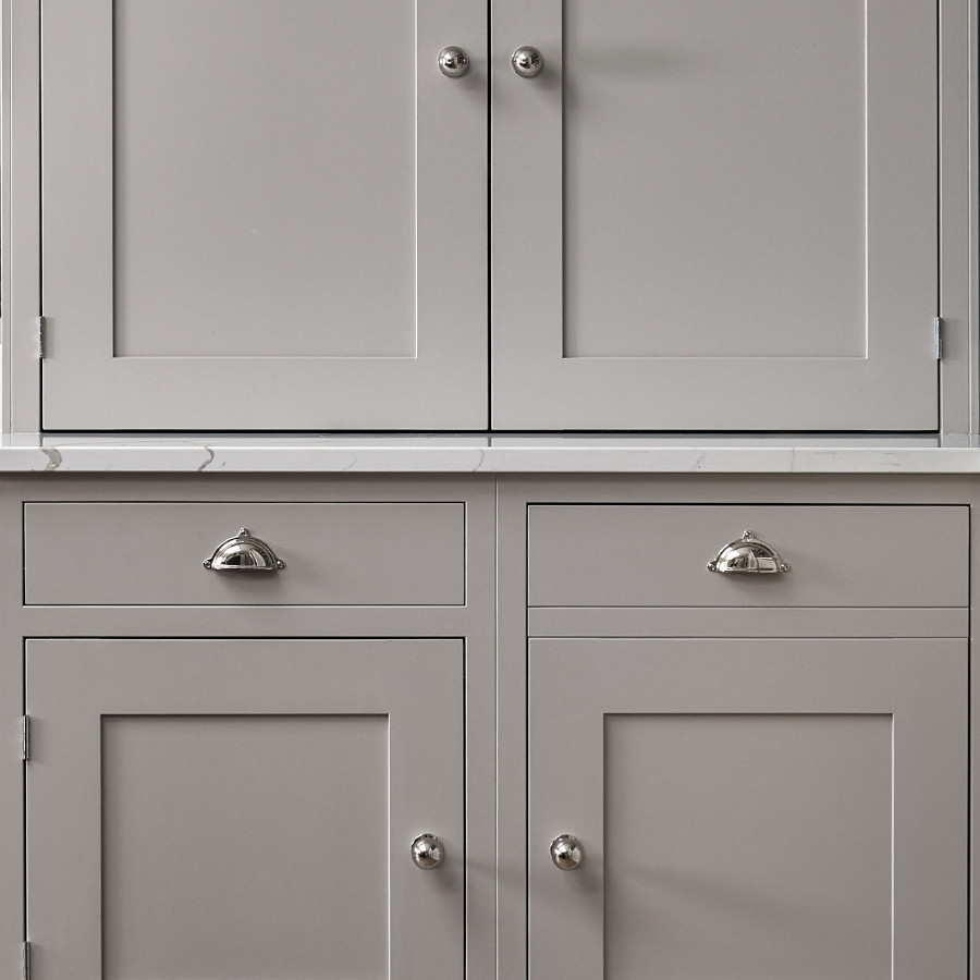
Monochromatic: Here, the idea is to take one colour and use it in varying tints and shades to create a neutral and calm space. Imagine a typical paint colour chart, showing gradients of the same colour. Take a light, mid and dark shade and intersperse these throughout the room. They will always work well together with no risk of colour clashes.

Analogous: This scheme is based on using neighbouring colours on the colour wheel or a graduation of colour as it merges into another. Once you add tints, shades and tones, you get an expanded colour wheel. So, following this scheme you could move from the lightest grey, into a mid tone blue-grey, down to the deepest darkest blue. We might pick a statement piece in the kitchen, for example the island, and paint this in the darkest tone. Then apply the lightest colour on the remaining cabinetry, tying these two contrasting colours together with the mid tone on the walls.

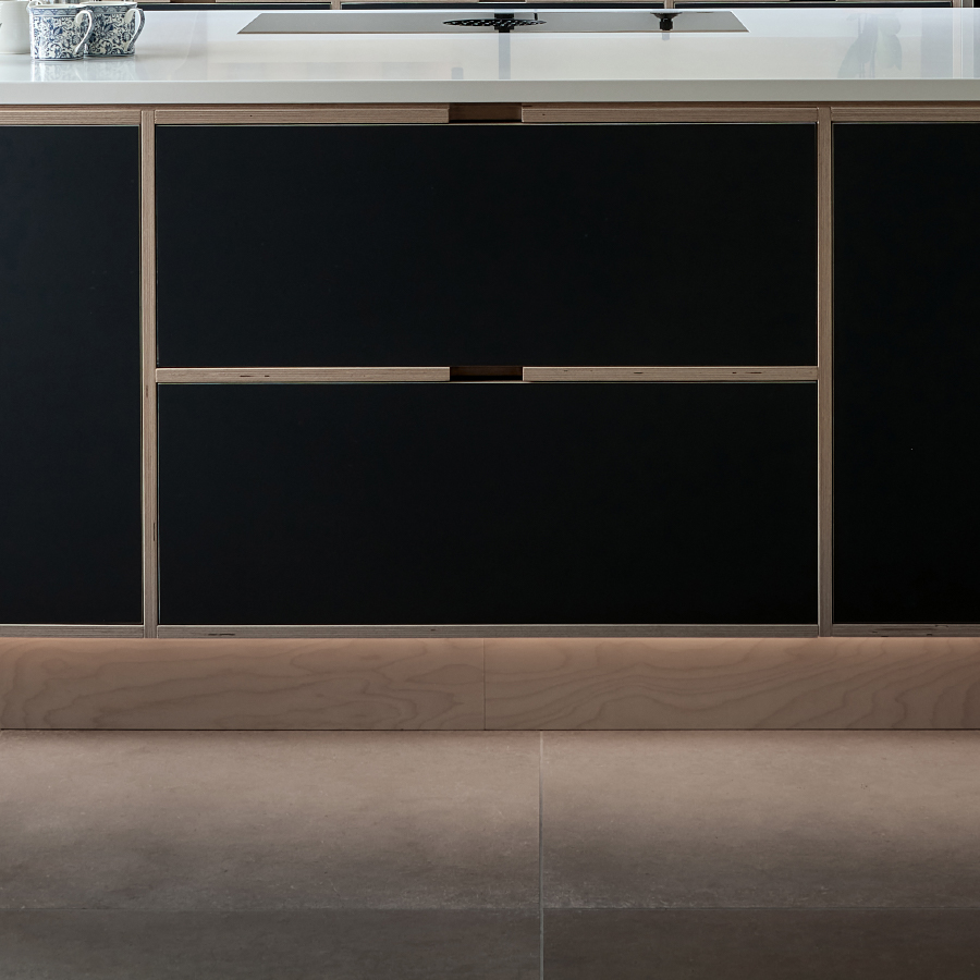
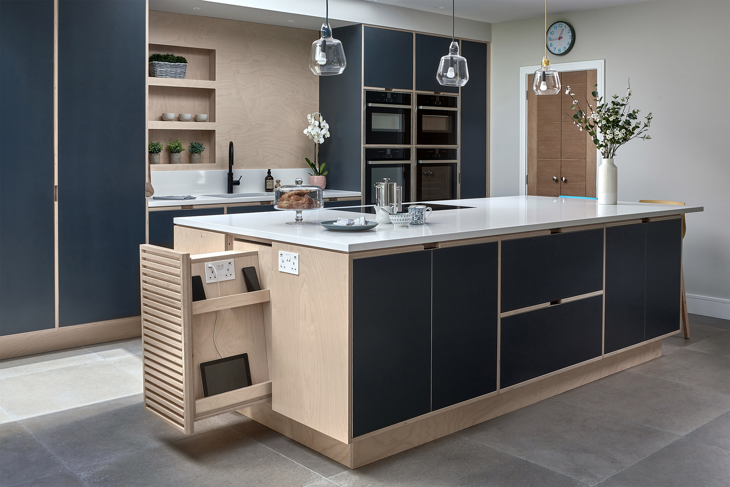
Complimentary: In a complimentary colour scheme, opposites attract. When pairing colours, you can find harmony through choosing two colours opposite to each other on the colour wheel. When you do this, the result is a striking, high-contrast colour combination. Blue and orange for example. In this instance, a burnished copper sink sits beautifully next to rich blue-black cabinets. Couple these with light and neutral tones in the worksurfaces, flooring and walls to maintain a sense of balance in the room.

Moreton Kitchen Bespoke Lighting
Arlington Kitchen Artisan Door Knobs | Classic Shaker

SPACE, LIGHT & WARMTH

It’s worth considering other factors that will have an impact on the colours you choose. The characteristics of the room coupled with an understanding of how colours will appear in their surroundings, will help to inform the decision you make.

Think about the size, shape and how light your kitchen is. Dark tones in a small space with little natural light can have an oppressive, closed in effect. Incorporating light tones will open up the room and reflect the light, as will reflective surfaces. Including glass splashbacks, gloss finished tiles and glass fronted cabinets can help give the impression of a light and airy space. In large, high ceilinged spaces with plenty of light, the opposite is true. Here, too many white tones can make the room feel sparce and clinical. Light shades should be balanced with warmer and darker tones, as the amount of light and space the kitchen has will ensure the room still feels spacious and inviting. Remember to consider your flooring and worktop as, after the cabinets, these two elements will take up the most space and be the biggest expanses of colour. It’s worth thinking about how they will work with your chosen colour scheme and if they will fit within the look you’re trying to achieve.

INSPIRATION

There are plenty of online resources to use for inspiration. Pinterest, Instagram and Houzz offer a multitude of images and are a good starting point to gather ideas. We always encourage clients to share any mood boards they create as it aids the design process and enables us to clearly visualise the end result they are hoping to achieve.

We’re always happy to advise on colour schemes and can guide you through your choices. Ultimately though, it’s your kitchen, so choose colours that appeal to you and will make you happy when you walk in to the room.

Bespoke Birch Faced Plywood Smart Storage

Begin your journey and contact us today

Get in touch